Technical Guide : Setup NextJS with Leaflet
Setup NextJS
you can create next js with create-next-js-app
npx create-next-app nextjs-leaflet
# or
yarn create next-app nextjs-leaflet
or use template like starter nextjs tailwindcss
npx degit sozonome/nextarter-tailwind nextjs-leafletNavigate to project
cd nextjs-leaflet
Setup Leaflet
Because leaflet its not reactjs, we need dependencies for reactjs with react-leaflet. Docs about react-leaflet can read here
yarn add leaflet react-leafletif you're using typescript, its react-leaflet support typescript too.
yarn add -D @types/leafletCreate Map Components
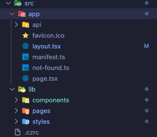
Take a Note, my components look like this:

First, we create Map Components in src/lib/components
import L from 'leaflet';
import { MapContainer, Marker, Popup, TileLayer } from 'react-leaflet';
const Maps = () => {
const icon = L.icon({ iconUrl: '/images/marker-icon.png' });
return (
<div className="w-full">
<MapContainer
className="h-[300px] w-full"
center={[51.505, -0.09]}
zoom={13}
scrollWheelZoom={false}
>
<TileLayer
attribution='© <a href="https://www.openstreetmap.org/copyright">OpenStreetMap</a> contributors'
url="https://{s}.tile.openstreetmap.org/{z}/{x}/{y}.png"
/>
<Marker position={[51.505, -0.09]} icon={icon}>
<Popup>
A pretty CSS3 popup. <br /> Easily customizable.
</Popup>
</Marker>
</MapContainer>
</div>
);
};
export default Maps;
Explain :
Import Statements:
import L from 'leaflet';: This line imports the Leaflet library, a JavaScript library for interactive maps.Lis a conventional shorthand used to refer to Leaflet.import { MapContainer, Marker, Popup, TileLayer } from 'react-leaflet';: This line imports specific components from thereact-leafletpackage. These components are React-friendly wrappers for corresponding Leaflet functionalities.
Component Definition - Maps:
const Maps = () => { ... };: This line defines a functional component namedMapsin React.
Leaflet Icon Configuration:
const icon = L.icon({ iconUrl: '/images/marker-icon.png' });: This creates a custom icon for map markers using Leaflet'siconmethod. The icon image is loaded from the specified URL (/images/marker-icon.png).- The issue arises due to the malfunctioning of the default icons provided by react-leaflet, necessitating the creation of custom icons.
Rendering the Map:
<div className="w-full">...</div>: The map is wrapped inside adivelement with a full width. Thisdivacts as a container for the map.<MapContainer className="h-[300px] w-full" center={[51.505, -0.09]} zoom={13} scrollWheelZoom={false}>... </MapContainer>: This is the root component for the map. It uses the following props:className="h-[300px] w-full": Sets the height and width of the map.center={[51.505, -0.09]}: Sets the initial geographical center of the map (latitude and longitude).zoom={13}: Sets the initial zoom level of the map.scrollWheelZoom={false}: Disables zooming in/out using the mouse scroll wheel.
Tile Layer Configuration:
<TileLayer ... />: This component is used to display the map tiles (the visual imagery of the map).attribution='...': Provides attribution text for the map tiles, which is a requirement for many free tile providers like OpenStreetMap.url="https://{s}.tile.openstreetmap.org/{z}/{x}/{y}.png": Specifies the URL template for loading map tiles.{s},{z},{x}, and{y}are placeholders that Leaflet replaces with actual values when making requests for tiles.
Marker Configuration:
<Marker position={[51.505, -0.09]} icon={icon}> ... </Marker>: Places a marker on the map.position={[51.505, -0.09]}: Sets the geographical coordinates where the marker is placed.icon={icon}: Applies the custom icon created earlier to this marker.
Popup Configuration:
<Popup> ... </Popup>: Defines a popup that appears when you click on the marker.- The content inside the
<Popup>tags (A pretty CSS3 popup. <br /> Easily customizable.) is the text displayed in the popup.
Export Statement:
export default Maps;: This line exports theMapscomponent, making it available for import and use in other parts of the application.
Overall, this Maps component renders an interactive map centered at a specific geographical point, with a single marker using a custom icon. When clicked, this marker shows a customizable popup with text.
Second, we import css from leaflet in layout.tsx
...
import 'leaflet/dist/leaflet.css';
import '@/lib/styles/globals.css';
...
Explain:
This ensures that the necessary CSS for creating a Leaflet map is present, allowing for the proper display and functionality of the map.
Third, we call Maps components and show it home components
'use client';

import type { NextPage } from 'next';
import dynamic from 'next/dynamic';

import SomeText from '@/lib/components/samples/SomeText';

const Home: NextPage = () => {
  const NotSSRMaps = dynamic(() => import('@/lib/components/maps'), {
    ssr: false,
  });

  return (
    <div className="mx-auto flex min-h-[60vh] w-full max-w-screen-lg flex-col items-center justify-center gap-8 text-center">
      <SomeText />
      <NotSSRMaps />
    </div>
  );
};

export default Home;
Client-Side Only Directive:
'use client';: This is a directive indicating that the code should only run on the client-side. It's specific to Next.js 12 and later versions, allowing you to specify per-module whether the code is intended for the server, client, or both.
Dynamic Import of NotSSRMaps Component:
const NotSSRMaps = dynamic(() => import('@/lib/components/maps'), { ssr: false });: Here, thedynamicfunction is used to import the maps component (@/lib/components/maps) dynamically. The option{ ssr: false }indicates that this component should not be rendered on the server during server-side rendering. This is often necessary for components that rely on window or other browser-specific APIs, which are not available during SSR.
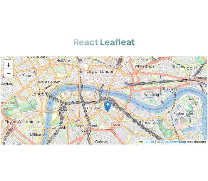
If everything is correct, it should display something like this:


